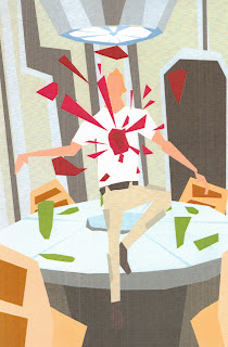
Tease of what I'm doing today
Tuesday, 4 December 2012
Wednesday, 24 October 2012
Tuesday, 9 October 2012
Merch........
i have recently acquired myself a society6 page, go ahead take a look...
http://society6.com/alacanty?promo=206ab6
http://society6.com/alacanty?promo=206ab6
Tuesday, 2 October 2012
Finals ....
This is the final image for the Red riding hood and Psycho collaborative piece, underlining the origins of horror.
And below is Baby psycho piece done in a different style im tying to develop a little better, i still want to focus more on 3D work though...
Labels:
3D,
3D Paper,
baby,
fairytale,
film,
good vs evil,
Horror,
illustrator,
Models,
Paper sculpture,
Papercraft,
poster,
psycho,
red riding hood,
sculpture
Sunday, 26 August 2012
Origins of Horror.......
Iv recently being creating a mock editorial on the 'Origins of horror', looking into influences of certain films like Ed Gein, who was the main influence for Psycho, Along with fairy tales and disease....
these are just the roughs, final will soon follow......
This idea came from the serial killer Ed Gein, and how from a young age he was deranged. Also showing ho anyone can be a killer.
This idea came from the links between the storyline of red riding hood and psycho. I the original Little red riding hood she doesn't escape and is eaten and killed. In both story's the female victim is lured into false security and friendship. In psycho its Norman Bates at the Bates motel and in Little red riding hood its the wolf at Grandmas house.
these are just the roughs, final will soon follow......
Labels:
baby,
fairytale,
film,
film poster,
Horror,
illustrator,
psycho,
red riding hood
Been a while..........
Labels:
3D Paper,
Alien,
chestburster,
film,
film poster,
john hurt,
Kane,
Models,
Papercraft,
poster
Friday, 25 May 2012
Alien film poster development........
Here is my development of my design for a film poster for ALIEN. I took the demise of the character Kane and used that scene to create an image. The first image is the rough, ad the rest are the stages of making the subject. the final image is close to the final (without text).
Labels:
3D Paper,
Alien,
chestburster,
film,
film poster,
john hurt,
Kane,
Models,
Paper sculpture,
poster
FLOWERS.......
I made some 3d flowers, using paper and card.
The idea is a ying yang symbol, good vs evil. The nice flower is a common daisy and the evil flower is a mix up of different thistles.
The first two images are the development and the photo is the final image.
Labels:
3D Paper,
circle,
daisy,
Flowers,
good vs evil,
Models,
Paper sculpture,
thistle,
ying yang
Monday, 30 April 2012
Cuckoo Update....
Saturday, 7 April 2012
Ipad Draw.....
Though i might upload some of the ipad drawings i did in life drawing. These are the ones i actually like. I put down the block colour first then went in with line.
I prefer the bottom two........
Thursday, 5 April 2012
One Flew?
Subscribe to:
Comments (Atom)


